
Big Game nerves
Alas, the 'years of hurt-ometer' for the England men's national team trundles on.
Maybe they got frit. They should've made Lionel Messi take penalties instead of sending in crosses: his non-shootout 50% rate in the World Cup is not just mortal, it's downright lowly.
And, hey, I know how they all feel, because today I have nerves too: if all has gone well you'll be reading this seamlessly from a new newsletter provider, with a brand new-looking website to head to.
If you're just reading Get Goalside for data, you can close the email now, no judgement, but I think this stuff is really neat.
If you're on the site, there are a couple of different reading experience things you may notice (and hopefully like). On a standard blog post, you'll see a chart like this -- each dot represents around 100 words, a slightly more tangible version of a progress bar.
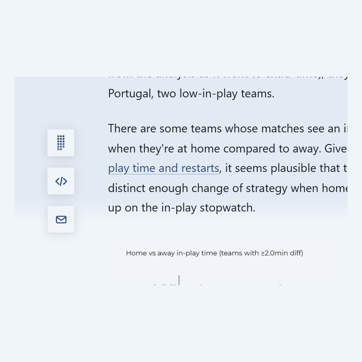
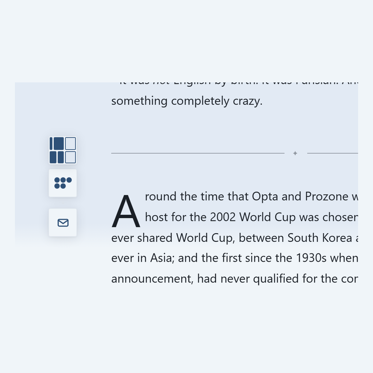
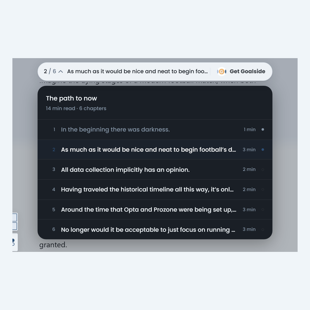
But on longer posts, with proper sections, you'll get two forms of progress. The dots here represent the words within that section, while the set of rectangles (a treemap) is your section-by-section progress. The longer pieces have chapter navigation in the navbar too.
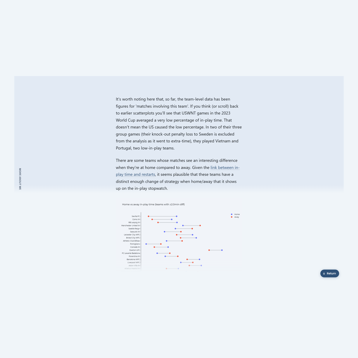
On all types of post, you may notice a slight 'sunset' gradient on the page as you scroll. This is another -- hopefully tastefully subtle -- cue about reading progression.
Truth is, as much as I enjoy reading and get a lot out of it, I really don't like the digital reading experience.
I'm also a long-time media nerd and have spent enough time with historical newspapers to know that media formats take a while to find their feet. So why not experiment?
A lot of inspiration, funnily enough, was drawn from reading real-life newspapers. With a newspaper (books too), there are different kinds of super-quick, almost ambient, reading progress cues. Each paragraph feels like a checkpoint, where the road ahead is but a blink away; you can leaf through pages to check where a chapter or section ends; in a newspaper, column inches don't just act as a progress-check, but as a speedometer as well.
It's not all about reading progress though. On posts where there is code available to view, the "</>" icon takes you to GitHub. I've collected together code for a few of the projects I've done on Get Goalside in the past, now all in one place (although some older projects have been lost to the wind).
There are other ideas (aren't there always) which may surface down the line. Just because the digital-reading experience is bad now doesn't mean it has to be. Maybe I'll come up with something that sticks. (Maybe lightning strikes twice).
I say this a lot, but get in touch with your thoughts and experiences. Be good bug reporters. (Although, if something's gone badly wrong with this email, I'll probably know pretty quickly).
For those interested in the tech/provider stack, this is now using buttondown as a newsletter service and Sanity as a headless CMS. There's an RSS feed for the newsletter, which is what buttondown pulls from to post out. (I've also ported over all the previous newsletter issues to this new RSS feed, in case anyone was using the feed which (I believe) the previous Ghost version of the site had; that site will be deprecated soon).
If you do head to the site, you'll also notice that there's a general blog. Those posts won't be sent as part of the newsletter.
Thanks for sticking with me,
Get Goalside
Get new posts delivered to your inbox.
Manage your subscription