Extra time for in-play time
Let's run things back.
In 2023, Get Goalside put its analysis where its attitude was and ran a couple of small-scale studies on 'ball-in-play' time. In 'Stop the clock', we confirmed our priors (which is always a little disconcerting): the 'worryingly low' levels of in-play time that top leagues were experiencing at the time (around 54 minutes) were, in fact, within normal ranges.
Since then, in-play time has risen, and we'll talk about that later on. But another, more important thing has happened: Statsbomb's released more data. So it's time for some updated analysis.
The data we'll be looking at here is a big set of women's football data: the 2023 NWSL season, 2023/24 seasons of the English, Italian, German, and Spanish top-flights, and, for an international flavour, the 2023 World Cup and 2025 Euros.
A headline? The WSL is even more in-play-pilled than FIFA.
But first, let's take a look at the most basic-but-fascinating chart of the day. The entire women's dataset* (two German teams aside) sits outside the interquartile range of the men's 2015/16 leagues* for total match-clock time.
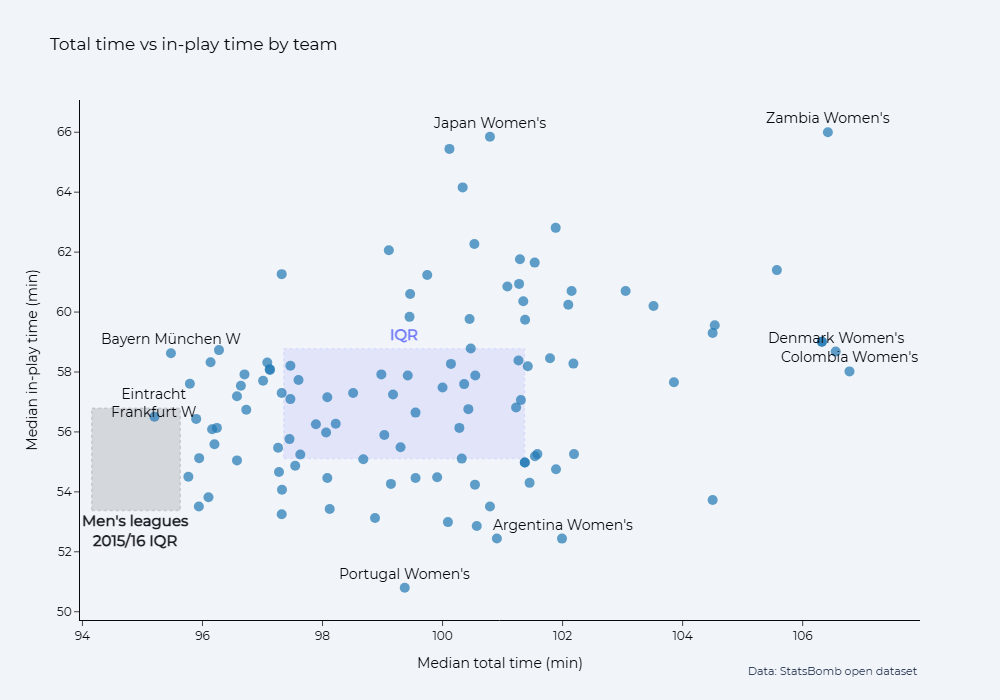
*I'll generally refer to this as 'this dataset' or 'the 2023/24 leagues' from here on, and refer to 'men's 2015/16 leagues' when talking about the Big Five European leagues from Statsbomb's dataset.
Sign up for the newsletter to get blog posts when they come out
There is an in-play difference but the big story is that these matches take much more time for the marginal increase in in-play time. This is easier to see below, where we see that the interquartile range of in-play time percentage is actually slightly lower than the men's 2015/16 league dataset.
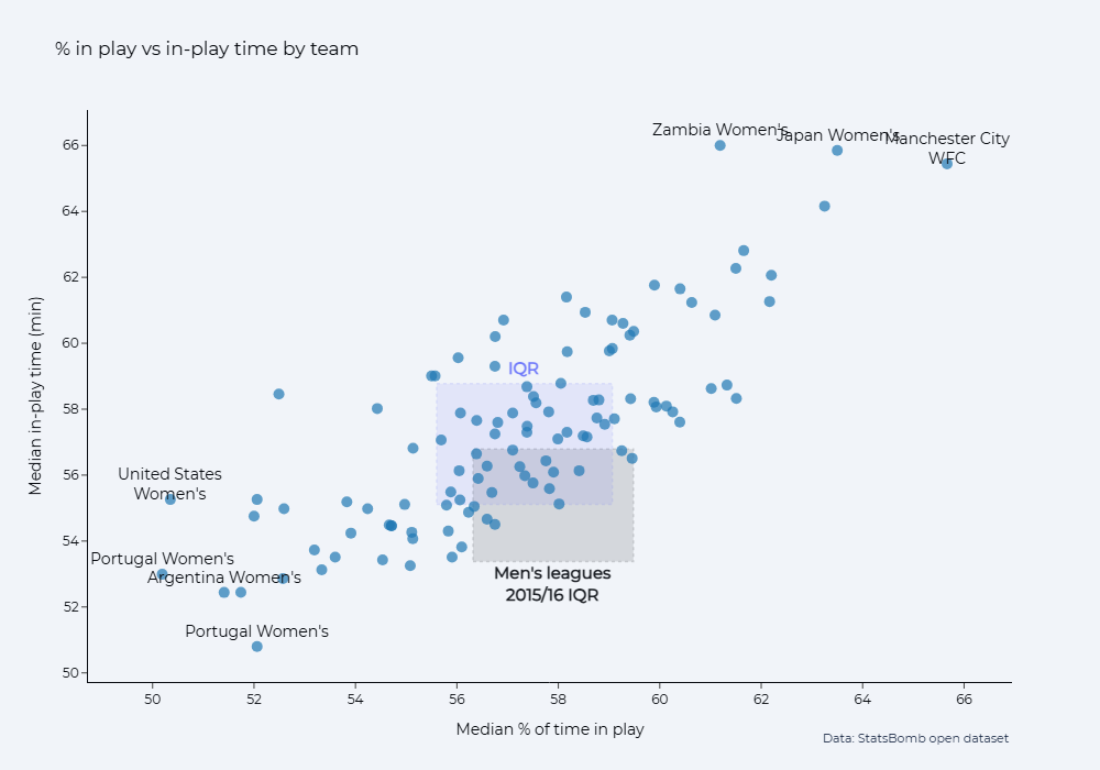
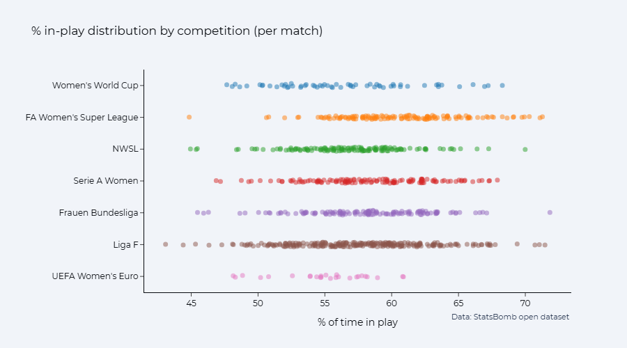
As you'll have picked up from the team labels on show, there's a big competition difference here within the more recent women's football dataset. Two competitions are particularly stark: the 2023 World Cup, and the 2023/24 English WSL.
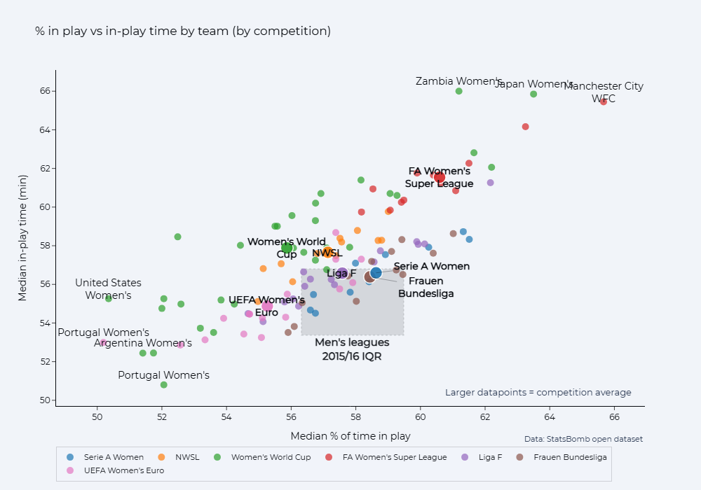
The World Cup's uniqueness is no surprise, as it was an outlier in the previous work, but the WSL is eye-catching. The median ball-in-play time of the competitions is as follows:
- 2023/24 English WSL: 61 minutes, 35 seconds
- 2023 World Cup (normal time matches only): 57 minutes, 52 seconds
- 2023 American NWSL: 57 minutes, 28 seconds
- 2023/24 Spanish Liga F: 56 minutes, 37 seconds
- 2023/24 Italian Serie A: 56 minutes, 31 seconds
- 2023/24 German Bundesliga: 56 minutes, 4 seconds
- 2025 European Championship: 54 minutes, 30 seconds
Plotting the data match-by-match, you can see just how different the WSL is to the other competitions in the dataset
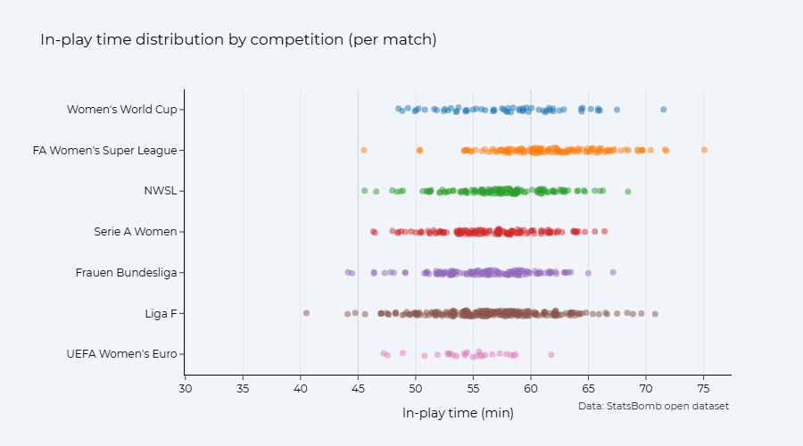
This is partly because WSL matches that season had a far higher percentage of in-play time than other competitions. Interestingly, the three competitions in this dataset which had VAR (2023 World Cup, 2023 NWSL, 2025 Euros) had the lowest percentage of game-time in play, although the match-level distributions generally don't look that different.
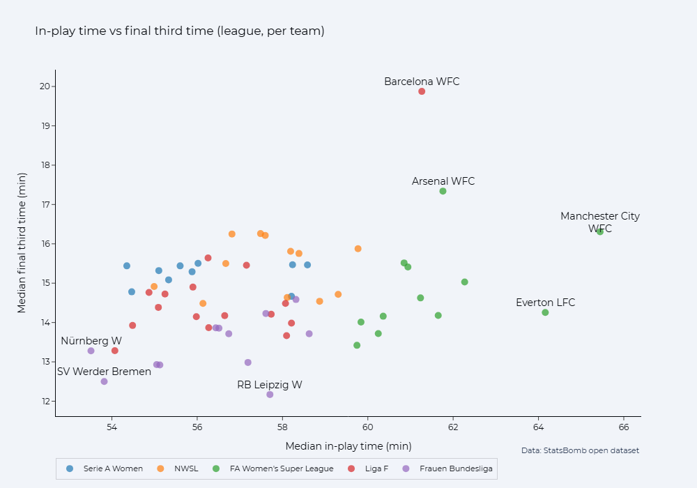
Unsurprisingly, this extra in-play time does not necessarily translate to extra excitement. WSL teams (from 2023/24) may average far more in-play time than the other teams in the dataset, but spend a very similar amount of time in the final third. (We'll look at league competitions only from here, for the larger sample sizes and smaller quality gap between teams).
It's worth noting here that, so far, the team-level data has been figures for 'matches involving this team'. If you think (or scroll) back to earlier scatterplots you'll see that USWNT games in the 2023 World Cup averaged a very low percentage of in-play time. That doesn't mean the US caused the low percentage. In two of their three group games (their knock-out penalty loss to Sweden is excluded from the analysis as it went to extra-time), they played Vietnam and Portugal, two low-in-play teams.
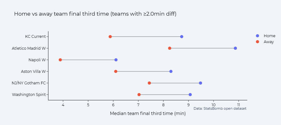
There are some teams whose matches see an interesting difference when they're at home compared to away. Given the link between in-play time and restarts, it seems plausible that these teams have a distinct enough change of strategy when home/away that it shows up on the in-play stopwatch.
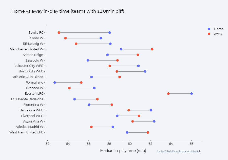
In many cases, you'll notice that the value when they're at home is higher than when away. Sevilla are the most dramatic, presumably a case of them seeking to play a possession-based style at home and being content to junk things up on the road. But for some the difference is in the reverse direction: teams more likely to sit back in a more passive defensive block and allow home teams to possess the ball uncontested?

If we split the final third time into the team's own time in the final third, we see a different picture for the WSL sides. Poor Bristol. (They were duly relegated that season).
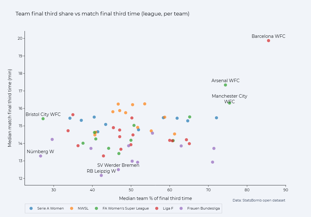
Some other notable things from this chart: Barcelona's complete Liga F dominance; Arsenal and Manchester City both having higher final third shares than actual league champions, Chelsea (in Emma Hayes' final season there); NWSL's parity showing – pretty much all teams sitting in the 40-60% range.
Sign up for the newsletter to get blog posts when they come out
The NWSL is a little weird in this dataset in terms of final third time though. Or, some of its teams were. There were six teams in the dataset who averaged 2+ minutes more time in the final third at home than on the road: three from the NWSL.
It would be interesting to follow-up this data with points, expected goals, and amount of restarts, but then we'd be here all day.
But, back to the question referenced right at the start of this piece: why is in-play time higher than the men's 2015/16 dataset? Particularly if the share of in-play time is lower?
Tendencies around added time looks like part of it (I mean, it'd have to be, given that the total match-clock time has increased). Now, the event data doesn't include the amount of time added by the refereeing team: only when match periods ended.
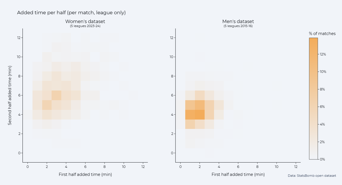
Although VAR doesn't fully explain this (as several 2023/24 women's leagues didn't have it), the increase to substitution numbers could be part of it. But only part. Substitutions rarely happen in the first half, and yet the trend of added time played shifts from overwhelmingly under two minutes in the men's 2015/16 leagues to a wider 1-4 minute spread in the women's 2023-2024 leagues. You'd need to examine this in more depth, but it seems plausible that subs, VAR, and a change of refereeing accountancy has changed these figures.
My assumption is that this is more to do with the datespan than gender of the competitions. There's no theory I can think of for why women's football would be stoppage time-d differently to men's football, and the 2023-2024 seasons followed the public fretting about time-wasting.
And, while I could also look up the situation on the Continent, I know off the dome that the PGMOL is responsible for officiating both the Premier League and the WSL in England. (Different officials, true, but same organisation).
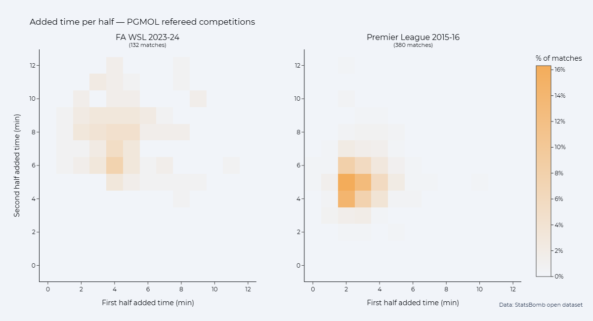
In a circular way, this draws back to the very first chart: this dataset of women's football (in 2023-2024) has higher ball-in-play time than the men's dataset (in 2015/16), but coming through more time added on, not through a higher share of the game spent in-play. Except the WSL which seems to do both. Never let it be said that the English don't care about value for money.
Sign up for the newsletter to get blog posts when they come out
A note on averages
In the charts with interquartile ranges, these are IQRs of the teams' averages, rather than match-level. This was mostly for convenience at the time which I didn't think it worthwhile to redo on a match level. I'd also argue it's interesting to have averages taken from both a match level and a team level because many fans will primarily experience their team's matches. Although the IQR of team-level data is an IQR of a set of median values, this probably captures the 'majority range of fan experience' better than an IQR of match-level values.